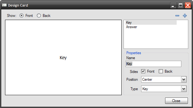
Card Designer allows you to change the appearance of flash cards. You can access it using →
The ability to alter the appearance of cards is one of the key features of Flash Card Master. Each item on a card is called a field and you can control the relative placement and the side on which the field will appear.
 will add a new field to the deck and
 will delete an existing field.
The show radio buttons control the side that is shown. Choosing Front will show the front of the card, and Back will show the back.
You can click on a field shown in the list to edit its properties. You can set the Name , which is a unique word to identify the field. You can also choose the side on which the field will appear. If you check Front , the field will be shown on the front side of the card. usually question goes here. Likewise, Back will place the field on the back side of the card. Answers are usually placed on this side. You can also check both check boxes and the field will be shown on both sides. Checking neither will hide the field.
The Position property controls the placement of the field on the card. There are 9 possible values.
The
Type
property can be set to describe the contents of the field. Possible values are
Key
,
Answer
and
Other
. Key is the same as a question. The property is used by the quiz component to generate quizzes. Other components may use this value as well. It is recommended that you set this value. A card should only have one Key and one Answer.
